LOGO DESIGNS


art for time
logo
This logo design is about the essence of Art for Time: the potential creative energy in any given moment of time. When we pause to be curious and creative about something inside us, a single moment can open up—unfurling and releasing meaning, awareness, and artistic expression well beyond that point in time.
“When we pause to be curious and creative about something inside us, a single moment can open up—unfurling and releasing meaning, awareness, and artistic expression well beyond that point in time.”
The form implies several meaningful shapes: a droplet, a flame, a paintbrush, a sound, a shell—a curling protection, an endless source, a swirling resonance, an expanding expression. It conveys a vessel, holding calming, refreshing cool around fiery heat.
The Art for Time process involves pausing our busy, fast-paced timelines to allow our creativity to express something from within us. It is a natural human process with the power to shift perspective, release tension, and improve our health and well-being.
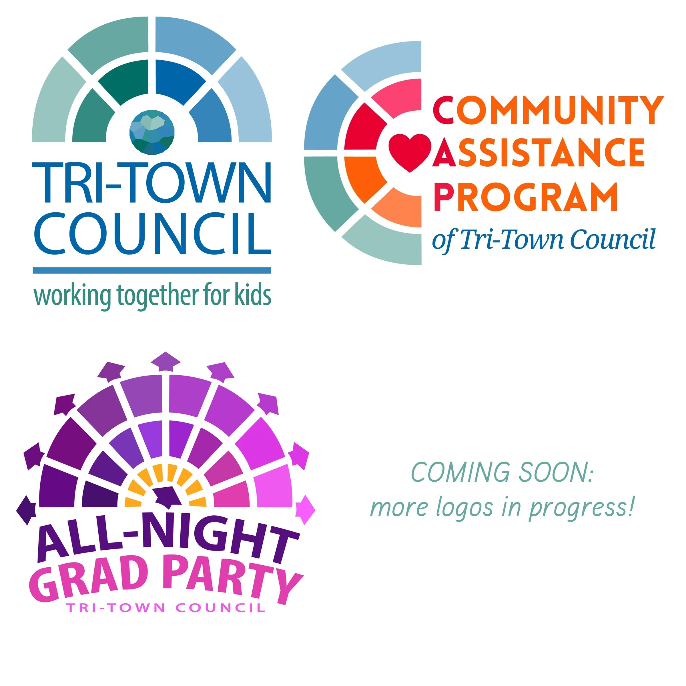
Tri-Town Council
program logos
I am honored to be going through the creative process with Tri-Town Council in developing a system of visually-linked logos for their various programs.
I updated the main TTC logo with a fresh look based on the traditional logo from the 1970s. The logo symbolizes a multi-faceted, radiating arc of protection, education, and development dedicated to the health and well-being of every single whole child within a caring community.
“The logo symbolizes a multi-faceted, radiating arc of protection, education, and development dedicated to the health and well-being of every single whole child within a caring community.”
The TTC Community Assistance Program (CAP) and All-Night Grad Party (ANGP) logos use the core “faceted, protective, radiating arc” shape from the main TTC logo design, but with meaningful and unique aspects that represent the essential concepts in each program.
The CAP logo shows the C of Community as a radiating arc of love and care. The ANGP logo shows the arc of night’s dusk to dawn radiating with references to graduation caps, arrows extending in all directions, while also implying a faceted disco-ball.
I am currently developing logos for other TTC programs, so stay tuned!
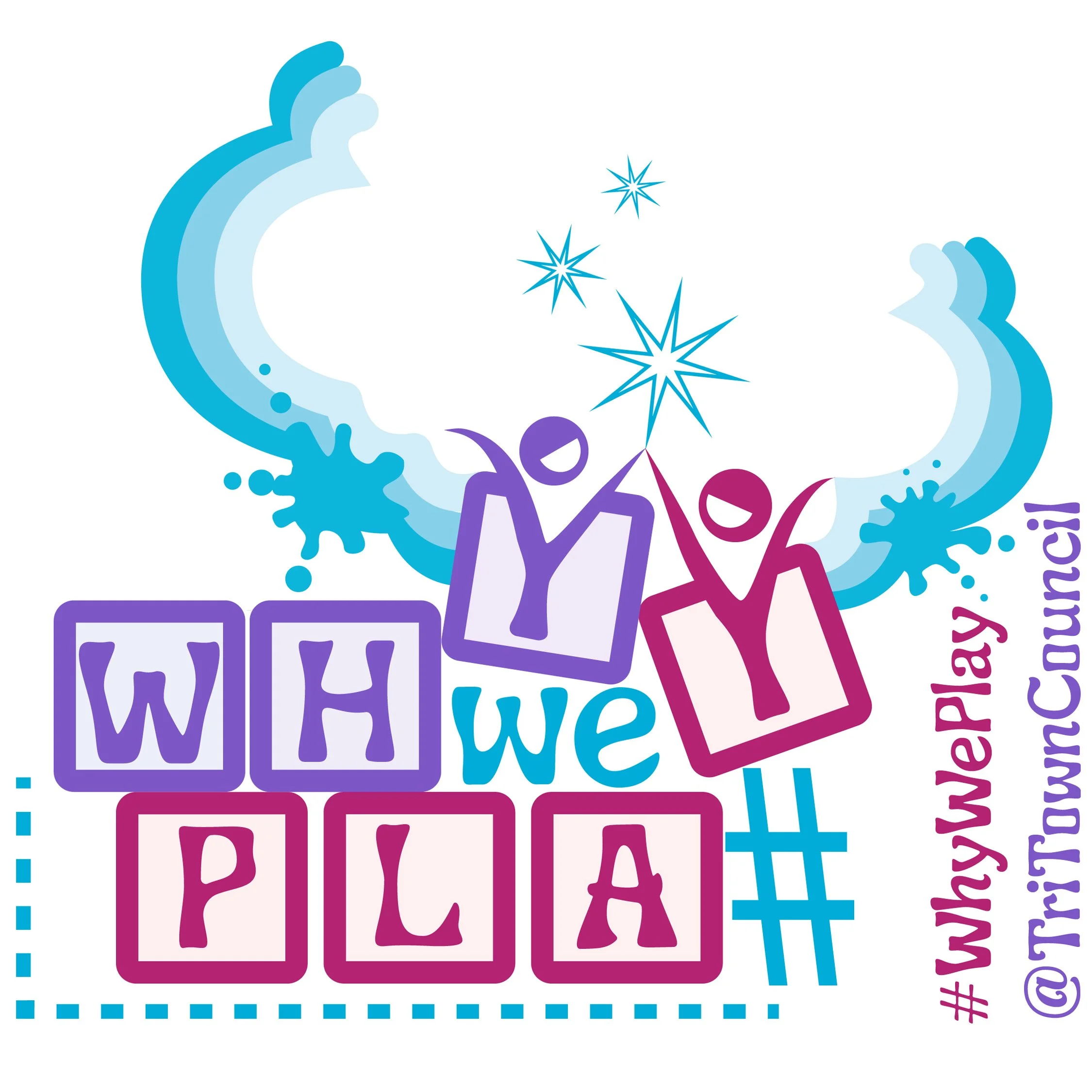
why we play
campaign graphic
This graphic was created for Tri-Town Council’s campaign about the importance of free play for healthy development. The “building blocks” are a metaphor for the foundational learning that happens in play, as well as being one of the first objects that children often play with.
The letter Ys in both WHY and PLAY are expanding beyond the shape of their blocks to represent playful children entering the magical creative and imaginative space of play.
“The letter Ys in both WHY and PLAY are expanding beyond the shape of their blocks to represent playful children entering the magical creative and imaginative space of play.”
The hashtag that would normally be at the start of the phrase has been moved to become a ladder for the Y in PLAY to reach the other. This represents the way that in true play we use whatever is available—sometimes transforming purpose to meet the needs of the playful spirit. It also represents the physical aspect of play, and the growth that happens when we try new things and climb up beyond what we know we were capable of.
This logo is about the remembering the essential learning that happens through making time for free play. The spirit and openness of play are also essential aspects of the creative process.
“The spirit and openness of play are also essential aspects of the creative process.”
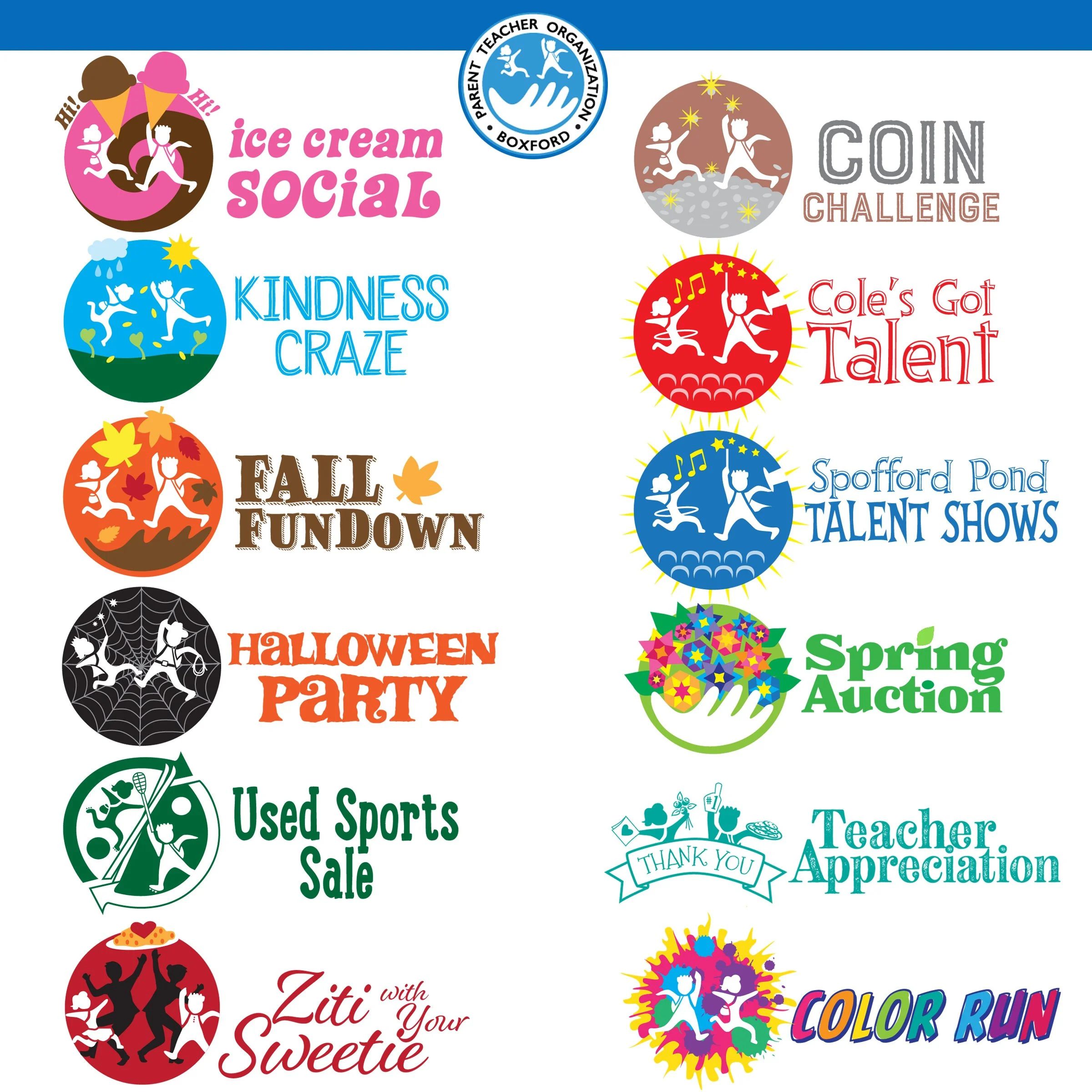
Boxford PTO
event logos
Our Boxford PTO (Parent Teacher Organization) works hard to create memorable events for our schools and community. Although I didn’t create the original PTO logo, I enjoyed creating this playful series of logos for twelve PTO events throughout the year. The event logos all use core elements from the main logo to visually connect them, as well as unique elements and style to distinguish each one.
Eleven of the logos use the children in variations to connect with the PTO logo, and the logo for the adult Spring Auction uses just the (adult) hand from the original PTO logo. Each logo’s unique identity is created through color, typographic style, and playful symbolism about the event.
These logos are about the care and joy that support our young people when parents and schools work together to build positive community and experiences.
“These logos are about the care and joy that support our young people when parents and schools work together to build positive community and experiences.”
These simple graphics represent a whole lot of creativity, energy, and love.
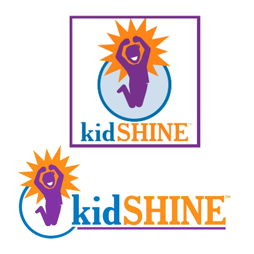
kidSHINE
logo
Occupational Therapist Dr. Amy Wheadon opened her dream company: a holistic activity center that helps to empower young people with confidence and skills (physical, cognitive, behavioral, social, etc.)
I had the honor of working with Amy to create the logo and identity system she envisioned for kidSHINE. The logo is used in signage, clothing, printed promotional materials, website, and social media.
This logo is about the joy and light that comes from recognizing one’s own accomplishments and inner strength.
“This logo is about the joy and light that comes from recognizing one’s own accomplishments and inner strength.”
Town of Boxford
campaign logo
The town of Boxford proposed the concept of caring for its whole community with a large, long-term plan that involved several different buildings, populations, and interests.
The logo represents the concept of different causes working in a holistic cycle together toward growth for all.
“The logo represents the concept of different causes working in a holistic cycle together toward growth for all.”
My portion of the campaign involved creation of the logo, signage, a series of flyer/updates, a website, facebook page, slideshow video, and promotional postcard. Although the plan wasn’t approved as initially presented, this campaign was an important step toward town spirit, care, and motivation for community projects that are in development now.
The logo and campaign are about the value of working together to take care of a whole community.